Web design company – Fastox
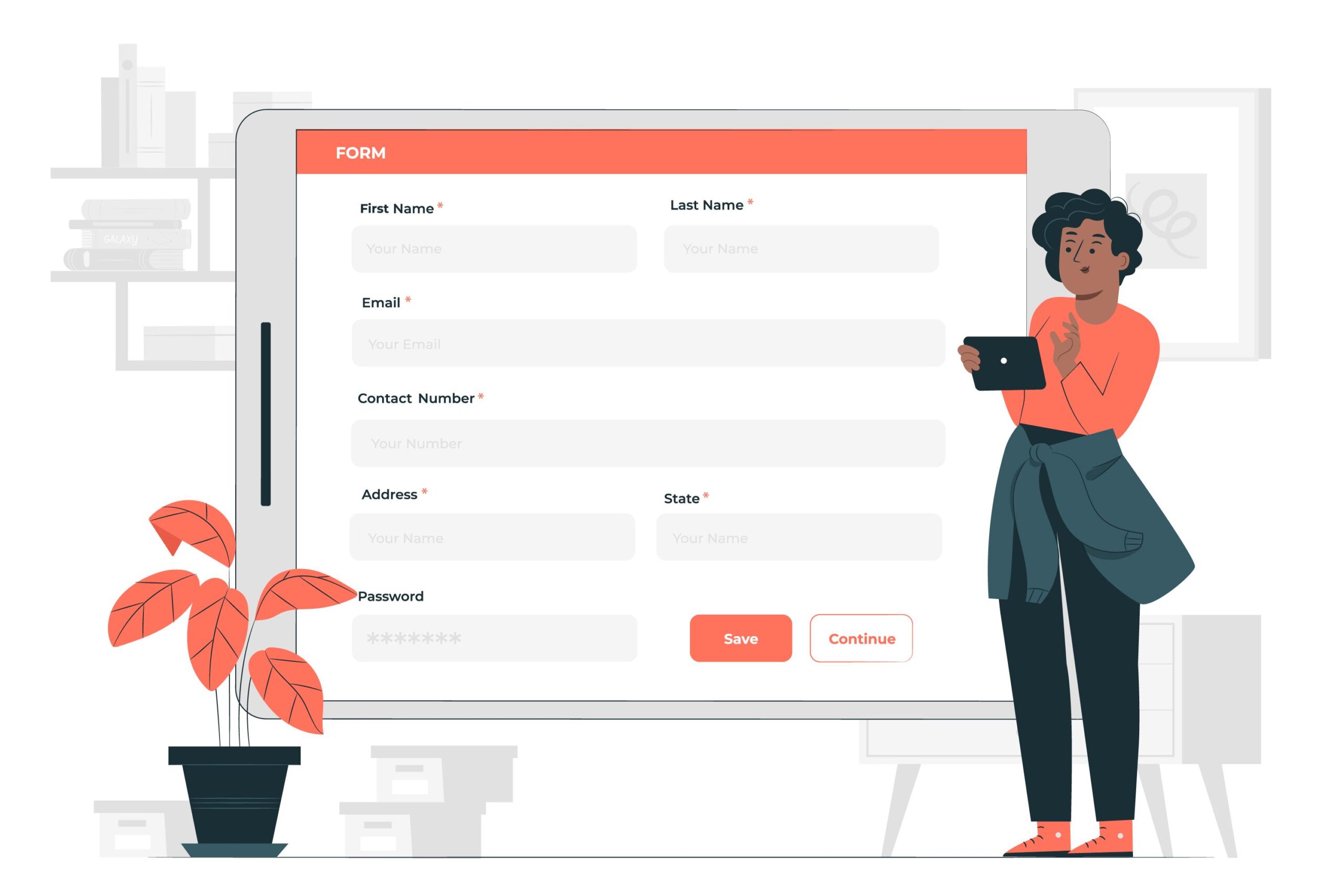
Designing a contact form can be an important part of creating a user-friendly website. Here are some tips and best practices to consider when designing your contact form:
- Keep it simple: A contact form should be easy to use and its should only ask for the essential information needed to get in touch with you. This can include name, email address, and message.
- Make it visually appealing: Use a clean and visually appealing design to make the form more inviting to use.
- Use clear and concise labels: Use clear and concise labels for each form field to make it easy for users to understand what information is being requested.
- Use appropriate input types: Use the appropriate input types for each form field to make it easier for users to fill out the form. For example, use a dropdown menu for selecting a state or country, and use a text field for entering a message.
- Use responsive design: Make sure the form is responsive and works well on all devices, including smartphones and tablets.
- Use clear and actionable buttons: Use clear and actionable buttons, such as “Submit” or “Send,” to make it easy for users to understand what will happen when they click the button.
- Provide clear instructions: Provide clear instructions on how to use the form and what information is required. This can help reduce the number of incomplete or incorrectly submitted forms.
- Use error messages: Use error messages to inform users of any issues with their submissions, such as missing fields or invalid email addresses.
- Use CAPTCHAs: Consider using a CAPTCHA to help a prevent spam submissions.
- Test the form: Test the form to make sure it is working correctly and that all information is being submitted and received as expected.
Web design company – Fastox


